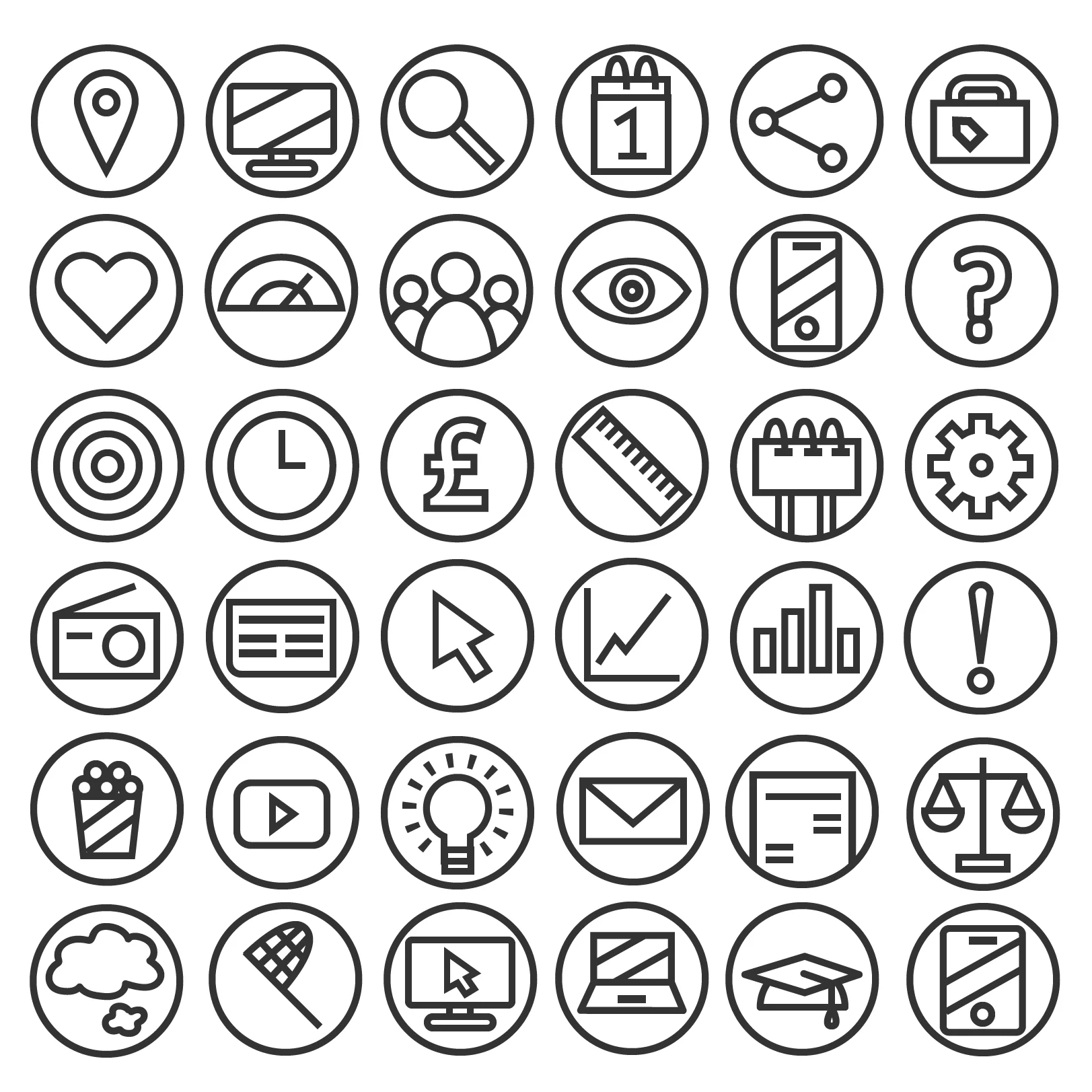
The library of icons to cover all areas of our business.
Presenting m/SIX in the best light.
THE BRIEF
Our colour guidelines
When I first joined m/SIX, there was no real branding or templates in use. This meant that while the work we were producing for clients was solid, we were being let down by our presentation. My challenge was to create an identity for the agency, as well as a range of templates and assets that would allow anyone to create smart looking presentations to convey ourselves as a bleeding edge media agency.
WHAT I DID
After discussing with the CEO and our MDs, we established what tone of voice the agency needed and how we wanted to convey ourselves in our communications. I then created guidelines specifying the company font, colours and even how our name is capitalised. All of this was to ensure we are consistent in everything we do.
As Powerpoint is our primary tool for presenting to clients, creating a template was key. Now the titles and text were in the same position, font and colour on every slide; I also created a library of m/SIX icons and flags so we could avoid the mess of using random icons found online.
Once the assets had been signed off and implemented I worked with our teams in New York and Singapore to ensure we were consistent internationally, and looked like a single company.
RESULTS
Now, everyone in the agency is equipped to present their work in the best possible light. So not only has our presentation improved, less time is spent hunting for the right icons online, and we have a clear identity that is consistent across our work, website, social media and international offices.
An example slide from the old presentation deck.
An example slide from a new
deck.